Signer Experience Best Practices: How to Get Documents Signed Faster
Practical signer experience best practices: clearer requests, mobile-first signing, accessibility, ESIGN consent and the metrics that show where signers drop off.

A good signer experience comes down to five things: a clear request, a short path to the signature, a screen that works on a phone, honest information about security and consent, and a way to learn where signers get stuck. Get those right and fewer documents stall. Your team also spends less time chasing people who gave up halfway.
This guide is for the business owner, team lead or operations manager who sends the documents. Your signers never pay you for a signing flow, but they decide whether the deal closes this week or next.
TL;DR
- Make the signing act unmistakable: one clear “Sign” button, shown after the full document, with a statement of what clicking means.
- Cut the path: pre-place fields, use templates, and show the signer where they are in the process.
- Design for the phone first: full-width pages, large tap targets, and controls within thumb reach.
- Explain consent and identity checks in plain words, and offer a paper option where the law requires it.
- Measure with short, timely surveys and completion data, then fix the biggest drop-off first.
Table of Contents
- What a good signer experience looks like
- Start with the request the signer receives
- Make the signing act unmistakable
- Shorten the path to the signature
- Design for the phone first
- Make it accessible to every signer
- Explain consent, security and identity clearly
- Perspective from BeeSign
- Measure the experience and improve it
- A checklist you can use this week
- Put it into practice with BeeSign
- FAQ
- Sources
What a good signer experience looks like
The signer is a person who got an email, probably on a phone, and wants to finish and move on. They are not evaluating your software. They are asking three questions: Is this legitimate? What exactly am I agreeing to? How long will this take?
Every best practice below answers one of those questions. Legitimacy comes from your branding, a recognizable sender and clear security information. Clarity comes from the document layout and the wording around the signature. Speed comes from fewer steps and fields that are already in the right place.
The same signer also sees your company, not your vendor. If the email, the signing page and the confirmation all look like they come from you, trust goes up. That is why we built white-label signing with custom domains and branded emails into BeeSign: the signer stays inside your brand from the first email to the signed copy.
Start with the request the signer receives
The signing session begins in the inbox. Most abandoned documents were lost before the signer opened the page, because the request looked unfamiliar or gave no reason to act now.
- Use a sender name the signer knows. A person or company name beats a system address.
- Write a specific subject line. “Your offer letter from Northside Dental is ready to sign” works better than “Document for signature.”
- Say what the document is and how long it takes. One sentence is enough: “This is a two-page lease addendum. It takes about three minutes.”
- Name the person to contact. If the signer has a question, they should know whom to ask without opening a new thread.
- Send from your own domain and branding. A familiar look reduces the fear of phishing, which is a real concern for people who sign documents on their phones.
Make the signing act unmistakable
Signers should never wonder whether they have signed. A practical implementation checklist from a U.S. law firm advises a discrete button labeled “Sign” that appears after the document, with an on-screen statement that clicking constitutes a signature creating a binding agreement. It also advises presenting the complete document before the signature block, not behind a link.
This is good design and good evidence. The signer sees what they are agreeing to, the action is deliberate, and your records show intent.
In practice:
- Use one primary action per screen. “Sign” or “Finish” should be the most visible button.
- Keep the document and the signature fields on the same page flow. Do not send the signer to a second site to read terms.
- Confirm completion on screen, then by email with the signed copy attached or linked.
- Avoid labels such as “Submit” or “OK” for the signing step. They say nothing about the consequence.
Shorten the path to the signature
Every field the signer has to find, every login they have to create and every screen that adds no information is a place to quit. The goal is to get from the email to the signed document with the least reading and tapping that is still legally and practically sound.
Pre-place fields and use templates
If you send the same document repeatedly, such as an offer letter, a tenant application or a vendor agreement, build it once as a template. Place signature, date and initial fields where they belong, pre-fill what you already know (name, email, role, start date) and leave only what the signer must supply. Our electronic signature tools include reusable templates and fillable forms for this reason.
Do not require an account
A signer who has to register before signing is doing your onboarding on your behalf. Let them sign from the link in the email. Use an access code or identity check only when the document risk calls for it (more on that below).
Show progress and guide the signer
For a document with several fields, show how many are left and take the signer to the next one automatically. A signer who sees “3 of 7 fields” knows the end is close. A signer who sees only a long scrolling page does not.
Order multiple signers deliberately
When two or more people sign, decide whether they sign in sequence or at the same time. Sequential signing suits approvals, where the second person needs to see the first signature. Parallel signing is faster when the order does not matter. Tell each signer who else is involved and what happens after they sign, so they do not wonder whether their part is finished.
Send reminders that help
A reminder should repeat the document name, the sender and the deadline if there is one, and link straight to the signing page. Space them out. One at two days and another at five is better than a daily nudge that trains people to ignore you.
Design for the phone first
Many signers open the request on a phone, often between other tasks. If the signing page only works well on a desktop, you lose them. Mobile e-signature UX is mostly about removing the pinch-and-zoom.
Make the page responsive. The document should take the full width of the screen and be readable without horizontal scrolling. Fixed-width PDFs squeezed onto a phone screen are the most common failure.
Put the main controls within thumb reach. Field navigation, “next” and the list of fields belong at the bottom of the screen, where a thumb rests, not at the top.
Make targets large enough to tap. The Web Content Accessibility Guidelines 2.2 set a minimum target size of 24 by 24 CSS pixels at Level AA, with spacing exceptions. Larger is better for a signature field the signer must hit while holding the phone in one hand.
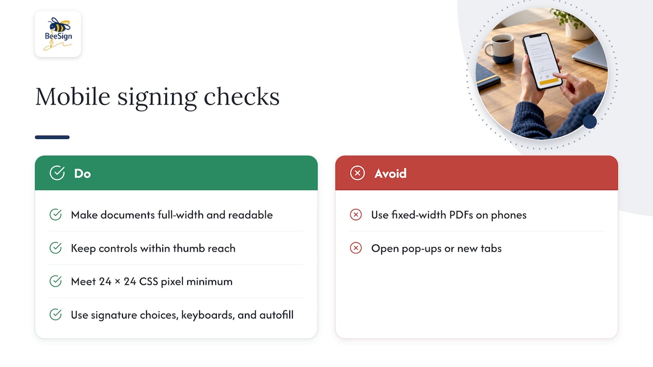
Keep the signature input simple. Offer typing a name, drawing with a finger or stylus, or uploading a saved image. Let the signer reuse their signature across fields in the same document.
Use the right keyboard. An email field should open the email keyboard, a phone field the number pad. Autofill saves taps and typos.
Avoid pop-ups and new tabs. On a phone they are easy to lose and hard to return from.
Test on real devices. Open your own signing link on an older phone, on a small screen and on a slow connection. If you have to pinch to read it, so will your signers.
Make it accessible to every signer
Accessibility is part of the experience, not an add-on, and it covers signers with visual, motor, hearing and cognitive disabilities. It also helps everyone using a phone in bright light or with one hand.
The U.S. federal government sets a clear reference point. Section508.gov states that form documents must work for keyboard users, follow a logical tab order, and provide the instructions and cues needed to complete the form. It also states that electronic signature software procured by federal agencies must conform to the Revised 508 Standards. If you serve public-sector or education customers, expect questions about this.
Practical checks for your own templates:
- Complete a document using only the keyboard. Tab order should follow the visual order.
- Give every field a clear, programmatic label, not just placeholder text.
- Check color contrast and do not use color alone to mark required fields.
- Test with a screen reader before you roll a high-volume template out.
- Write plain-language instructions. Short sentences help every signer, including those reading in a second language.
If your signers speak different languages, see our guide to designing a multi-language signer experience.
Explain consent, security and identity clearly
Trust is built by telling signers what is happening and why. Vague wording (“for your security”) makes careful people hesitate. Specific wording (“we will ask you to photograph your driver’s license and take a selfie so we can confirm it is you”) makes them comfortable.
Consumer consent under ESIGN
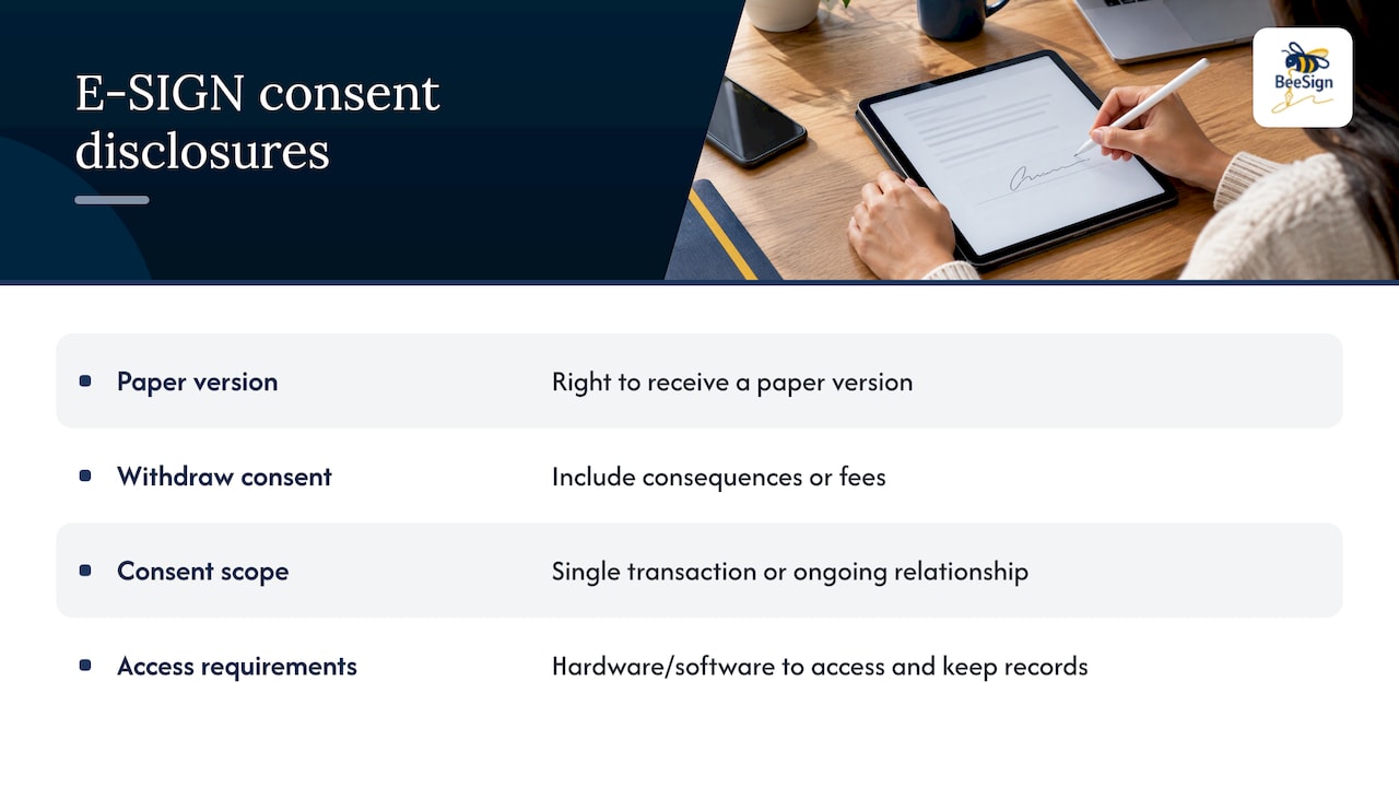
When a U.S. business must give a consumer information in writing and wants to deliver it electronically, the E-SIGN Act has specific steps. Section 101© requires a clear and conspicuous statement of the consumer’s right to receive a paper version, the right to withdraw consent and any consequences or fees, the scope of consent (a single transaction or an ongoing relationship), and the hardware and software needed to access and keep the records.
Put this in plain language on the first screen of the flow, before the document. Offer a paper alternative where the rule applies. If you are unsure whether your documents fall under the consumer rules, ask your attorney. Our article on whether electronic signatures are legally binding explains the legal basics, and the Uniform Electronic Transactions Act states that a record or signature cannot be denied legal effect solely because it is electronic.
Match verification to risk
Not every document needs the same check. An NDA with a known contact may need only an email link. A lease, a loan-related form or a medical consent may justify more. The same U.S. law-firm checklist recommends multi-factor authentication or a second identifying factor, and identity verification for high-risk documents.
When you do add a check, tell the signer before it starts:
- What they will need (ID document, phone camera).
- How long it takes.
- Why you are asking.
- What happens if it fails and who can help.
BeeSign’s identity verification supports government ID capture and biometric face matching inside the signing flow, so the signer does not leave the page. For more on choosing when to use it, read our guide to document signing with identity verification.
Tell signers what happens to their record
After signing, the signer should get a copy, know where it is stored and see that an audit trail exists. A complete audit trail records who signed, when and how, which protects both sides if the agreement is ever questioned.
Perspective from BeeSign
We see the same pattern across startups, real estate agencies, schools, HR teams and online sellers: signers do not abandon documents because signing is hard. They abandon them because something feels uncertain. A sender they do not recognize, a page that looks like a third party’s product, a request for a document they do not understand.
That is why we start with ownership of the experience. With white-label signing, you run BeeSign under your own branding, custom domain and branded emails. With bring-your-own-cloud storage, signed documents stay in your own infrastructure. Our design goal is that the signer sees you, not us, and that you control where the record lives.
We also think the signing flow should be a workflow, not a single page. Templates, fillable forms, approvals, identity checks and tracking belong together, so a new hire or a tenant moves from the first email to the final copy without repeated data entry. Our flat-rate pricing without per-envelope fees is meant to make it easy to send every document through the same good flow, not only the ones that seem worth the cost.
If you take one thing from this guide: sit down once, sign your own document as a stranger would, on a phone, and fix the first thing that makes you hesitate.
Mustafa Abusharkh
Measure the experience and improve it
You cannot improve what you do not watch. Two kinds of data matter: what signers do, and what they say.
What signers do
Track these for each template:
- Completion rate: documents completed divided by documents sent.
- Time to sign: from send to final signature, and from opening to final signature.
- Drop-off point: the page or field where signers leave most often.
- Device split: how many signers use phones and how their completion compares with desktop.
- Reminder effect: how many signers finish only after a reminder.
Real-time tracking makes this routine. Look at one template at a time. If a lease addendum has a 90 percent completion rate and the vendor form 60 percent, fix the vendor form.
What signers say
A short survey after signing reveals what the numbers cannot. The U.S. Department of Labor’s guidance on survey design recommends open-ended questions to surface new issues, timing surveys so respondents still have enough context to answer, and letting program goals shape the questions instead of relying only on rating scales.
Applied to signing, ask at most three questions, right after completion:
- Was anything unclear about what you were signing?
- Did anything slow you down?
- What would you change?
Change one thing at a time
Pick the biggest drop-off, make one change (a shorter email, a pre-filled field, a clearer button) and compare the next batch of documents with the last. Changing five things at once tells you nothing.
A checklist you can use this week
| Stage | What to check | Why it matters |
|---|---|---|
| Request email | Known sender, specific subject, time estimate | Signers open what looks familiar |
| First screen | Branding, consent text, paper option where required | Builds trust and meets ESIGN steps |
| Document | Full document shown before the signature block | Signer knows what they agree to |
| Fields | Pre-placed, pre-filled, with progress shown | Fewer steps, fewer errors |
| Mobile | Full-width pages, thumb-reach controls, large targets | Most requests are opened on phones |
| Accessibility | Keyboard test, labels, contrast, screen reader | Every signer can finish |
| Identity | Check matched to document risk, explained up front | Security without surprise |
| Completion | Clear confirmation and a copy for the signer | Closes the loop |
| Measurement | Completion rate, drop-off, short survey | Shows what to fix next |
Put it into practice with BeeSign
If you want these practices built into the platform you use, BeeSign brings templates, fillable forms, approvals, identity verification, audit trails and a developer REST API into one workflow. You can run it under your own brand with a custom domain and keep storage in your own cloud. Plans start with Individual at $9.99 per month, and every plan begins with a 7-day free trial. Enterprise and customized integrations are available on request, and you can see the details on the pricing page.
If you are still comparing options, our guide to choosing a document signing platform lists the criteria that matter, and our article on choosing eSign Act compliant signature software covers the compliance side.
FAQ
What is the most important signer experience best practice?
Make the request and the signing action clear. The signer should know who is asking, what the document is, how long it takes and which button completes the signature. Most other improvements, such as templates and reminders, support that clarity.
How do I improve mobile e-signature UX?
Use full-width, responsive pages, place navigation controls within thumb reach and make tap targets at least the size WCAG 2.2 sets for Level AA. Let signers type, draw or upload a signature, and test your own signing link on a real phone before you send it to customers.
Do signers need an account to sign?
They should not need one for most documents. A secure link in the email is usually enough. When the document carries higher risk, add a second factor or an identity check and explain it before the signer starts.
Do I have to offer a paper option?
Sometimes. When ESIGN consumer rules apply, the business must give a clear statement of the consumer’s right to a paper version and the right to withdraw consent. Ask your attorney whether your documents are covered.
How often should I send reminders?
Keep them few and useful. One reminder after about two days and another after about five is a sensible start, and each should name the document and link straight to it. Check your reminder data to see what works for your signers.
Sources
- Electronic Signature Implementation Checklist: A Practical Checklist (MC Law)
- Web Content Accessibility Guidelines (WCAG) 2.2 (W3C)
- Electronic Signatures (Section508.gov)
- Title I, Electronic Records and Signatures in Commerce (govinfo.gov)
- Uniform Electronic Transactions Act (1999)
- Evaluating customer experience with survey design (U.S. Department of Labor)
Recommended
Ready to transform your workflow?
Start using BeeSign today and experience the future of document signing